Designing in-app message Stories
While Classic in-app messages allow you to present multiple pieces of content using Pages, they require users to manually navigate between Pages via buttons or swiping. With Stories, you have the flexibility to set the duration for each page, enabling automatic transitions to the next page or the dismissal of the campaign, ensuring a smooth and intuitive user experience.
Furthermore, in-app Stories support a range of familiar, out-of-the-box functionalities, streamlining the design and deployment process.
Create a Story
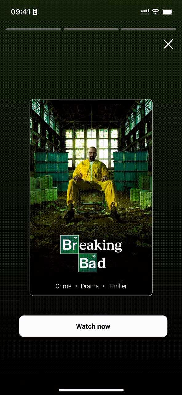
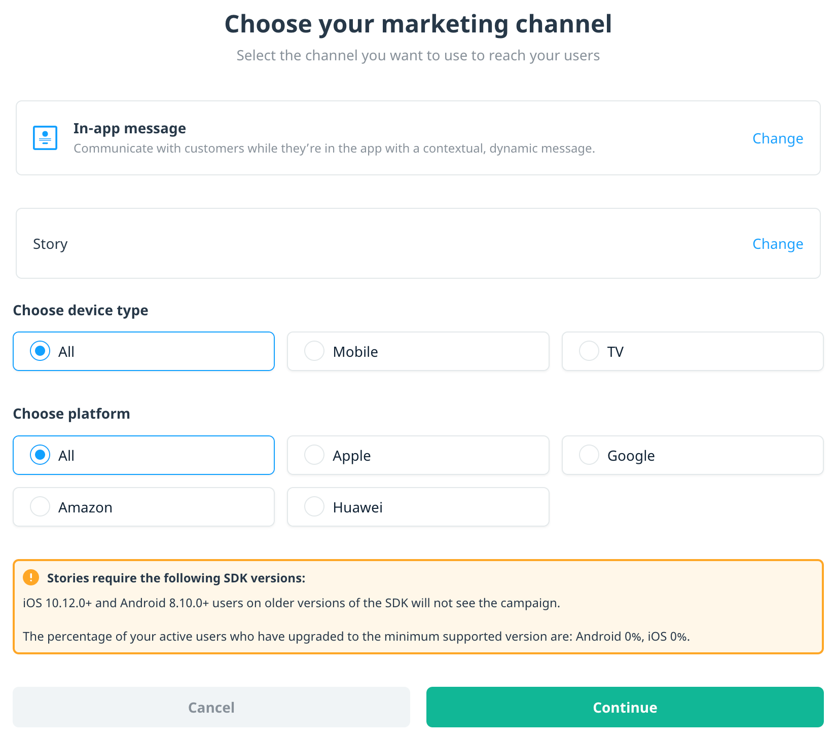
To create a Story-type in-app message, create an in-app campaign as you normally would. For the channel, select In-app message, then select Story as the campaign type.
Story settings
In-app message Stories have the same capabilities as Classic in-app message campaigns, in addition to several Story-specific settings.
To configure your campaign’s Story settings, open the Content page, and select the Story settings tab.
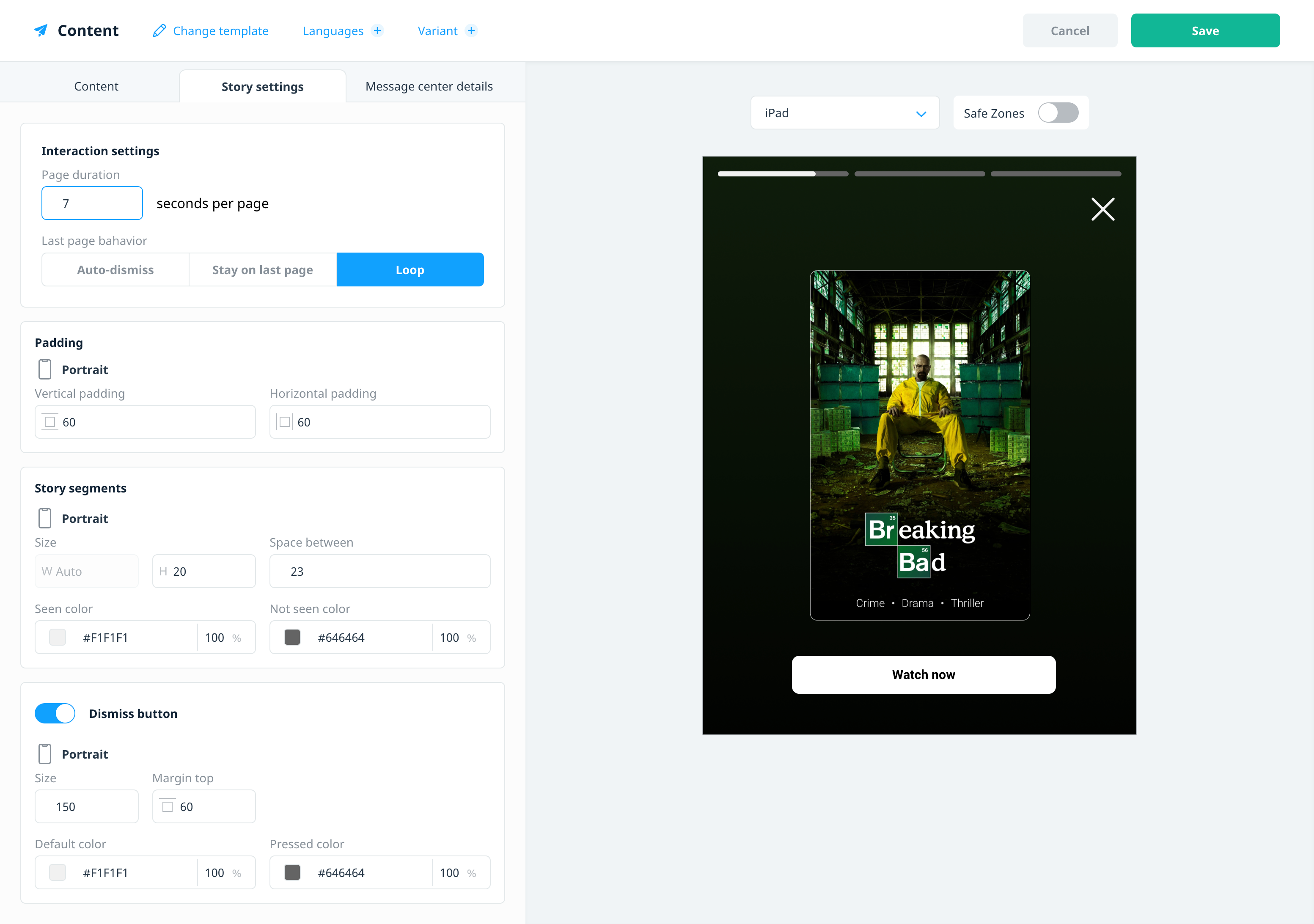
Interaction settings
Use Interaction settings to configure how the story behaves:
- Page duration: Define how long each page is displayed (1-60 seconds) before it automatically transitions to the next page.
- Last page behavior: Define the action once the page duration is reached on the last page of the Story.
- Auto-dismiss: Dismisses the campaign.
- Stay on last page: The last page is displayed until the user manually dismisses the campaign or navigates to another page.
- Loop: Restarts the story from the first page.
Padding
Use padding to position the Story segments container and Dismiss button (if enabled) relative to the device screen. The Story segments container is anchored to the top of the screen and the Dismiss button directly below it.
- Vertical padding: Defines the space between the top of the screen and the Story segments container.
- Horizontal padding: Defines the space between both the Story segments container and Dismiss button, and the sides of the device screen.
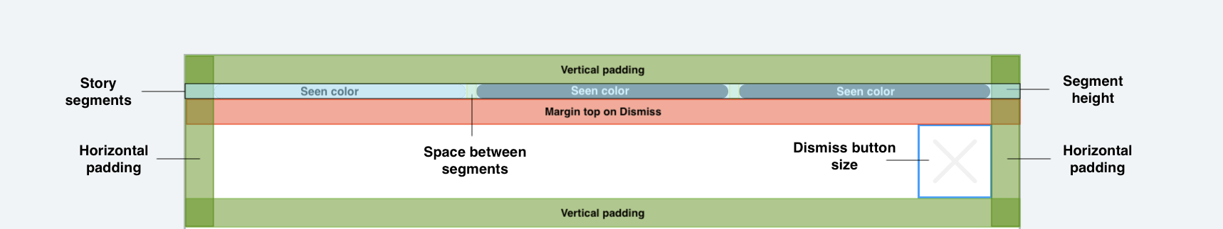
Story segments
Story segments serve as an indicator of a user’s progress, with each segment representing a distinct page. These segments visually depict the time spent and the remaining time on each page.
Customize the style of your Story segments to integrate with the design of your app:
- Width: Automatically expands the width of the device screen, taking into account the horizontal padding.
- Height: The height of the Story bar segments.
- Space between: The space between the individual segments.
- Seen color: The color used to fill the segment as time elapses on the current page.
- Not seen color: The color used to represent the remaining time on the current page.
Dismiss button
Stories contain a built-in dismiss button, which is anchored to the bottom of the Story segments.
- Size: Defines the height and width of the dismiss button.
- Margin top: Defines the space between the top of the dismiss button and the bottom of the Story segments.
- Default color: The color of the dismiss button.
- Pressed color: The color of the dismiss button when the user selects the button to dismiss the campaign.
While multi-page campaigns enable users to navigate through pages by swiping, with in-app message Stories, users can easily move between pages by tapping the message background. Simply tap the right side of the background to advance to the next page and the left side to navigate to the previous page.
Next steps
- Localize and A/B test your campaign content. For more information, see Localizing and A/B testing campaign content.
- Test your in-app message campaigns. For more information, see Testing in-app and embedded campaigns.