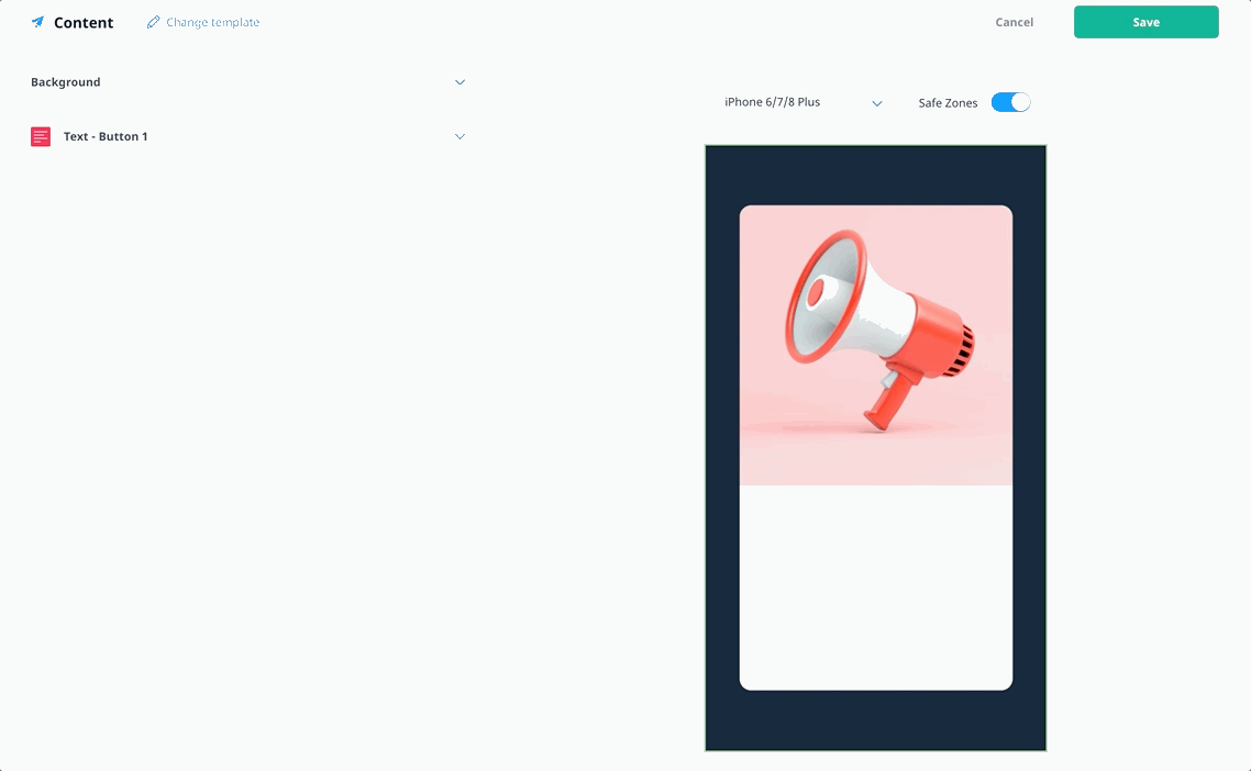
Editing in-app message content
In the in-app messages workflow, there are several tools to help you add to and edit the content of your in-app message campaigns. This article explains how to use the various options available in the content editor.
For more information about the in-app message workflow and selecting a template, see Creating in-app message campaigns. For information about using our Pages feature, see Building Pages.
Dynamic elements
Once you have selected your message template, you now have the option to add dynamic elements to your in-app campaigns. Add image, text, or buttons directly in the content editor without changing the base template.
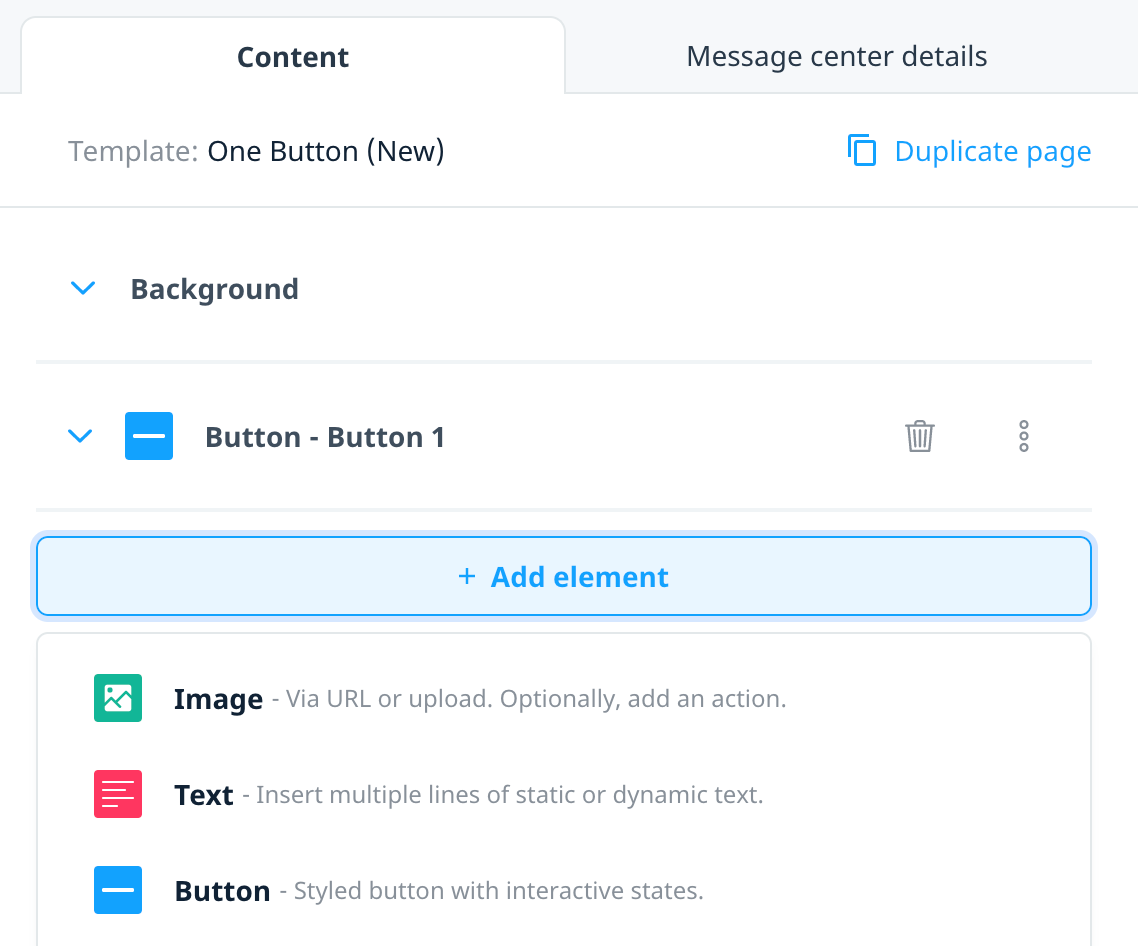
Add elements
To add more in-app elements to your message, select the + Add elements button and choose the relevant content type. Update an element with a unique name that provides the purpose, content, or action.
Duplicate elements
Copy an existing message element using the Duplicate option from the element action menu. This action will clone the entire element, including its content, position, and size.
Rename elements
To improve the readability of the content within the content builder, choose the Rename option from the element action menu and enter the new element name.
Remove elements
Remove any message element or template placeholder with the exception of an in-app background.
Layering elements (new!)
Once you’ve added your elements, move them forward or backwards to layer your content as desired. By default, the most recently created element appears at the front of the message.
Drag and drop
Select the element, then drag and drop it below or on top of another element in the form. The lower the element in the form, the further forward it appears in the in-app message, relative to other elements. The background is locked to the top of the form, and therefore always appears behind all other elements.
Element order controls
Select one of the ordering options from the element action menu:
- Bring to front: Moves the element in front of all other elements.
- Bring forward: Moves the element forward one spot.
- Send backwards: Moves the element back one spot.
- Send to back: Moves the element behind all non-background elements.
Message content
The sections that display in the Content editor depend on the template you select. Your in-app message campaign is made up of a background and one or more types of content. While the message template must always include background media, the number of buttons and button content type is configurable.
Background
Every template requires background content. Swrve supports using both static and animated images (GIFs) as the media type.
Media type: Image
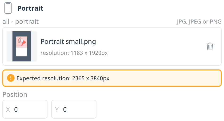
To help you use a single piece of artwork across all platforms and devices, the Background Image section displays two dimensions: the recommended size of the image you want to upload and the safe zone resolution. Swrve automatically resizes uploaded images for all devices. For more information about image guidelines, including sample images you can download for reference, see In-app messaging best practices.
There are two options for adding a background image:
- Upload a static image file.
- Enter the image URL and, if required, include user properties to personalize the content.
Option 1: Upload an image file
- To add an image for your message background, drag the image you want to use to the Upload file area or select choose file to upload a local file.
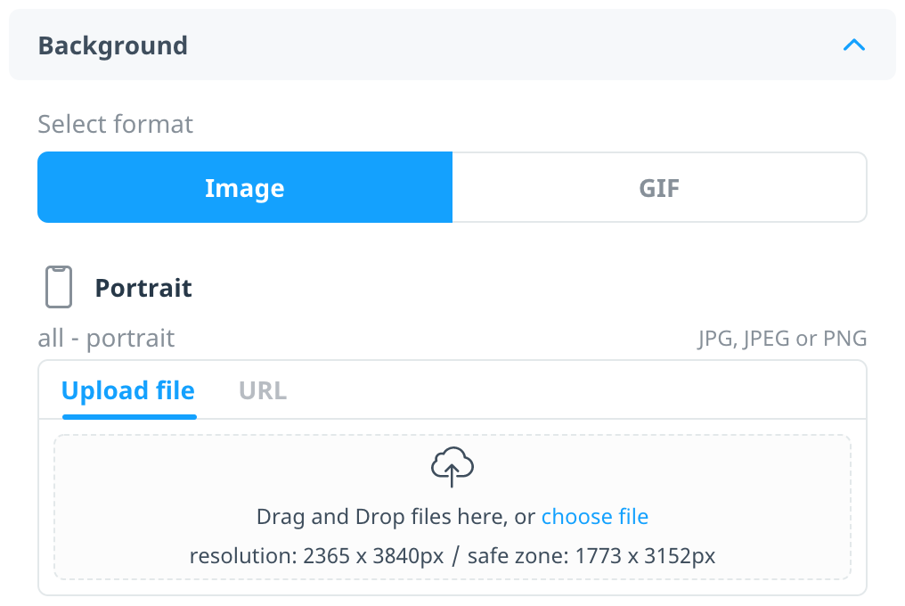
- Check the device preview to ensure the uploaded image adheres to the resolution requirements and that all important aspects of the image fit within the safe zone dimensions. A warning displays if the uploaded image resolution doesn’t match the template’s recommended resolution.
Option 2: Enter image URL
- To add an image URL, select URL and enter the relevant link.
- Once you’ve entered your image URL, select Add URL.
Media type: Animated image (GIF)
Add a video or animated image using GIF format, with the MIME type of image/gif and hosted on an HTTPS server. Swrve automatically downloads the content to your users’ devices and if the asset fails to download, the fallback image is used instead. If no fallback image is available, the in-app message is not displayed.
To optimize performance, we recommend keeping the file size to less than 2MB. Similarly, avoid using multiple GIFs in the same message or across multiple pages
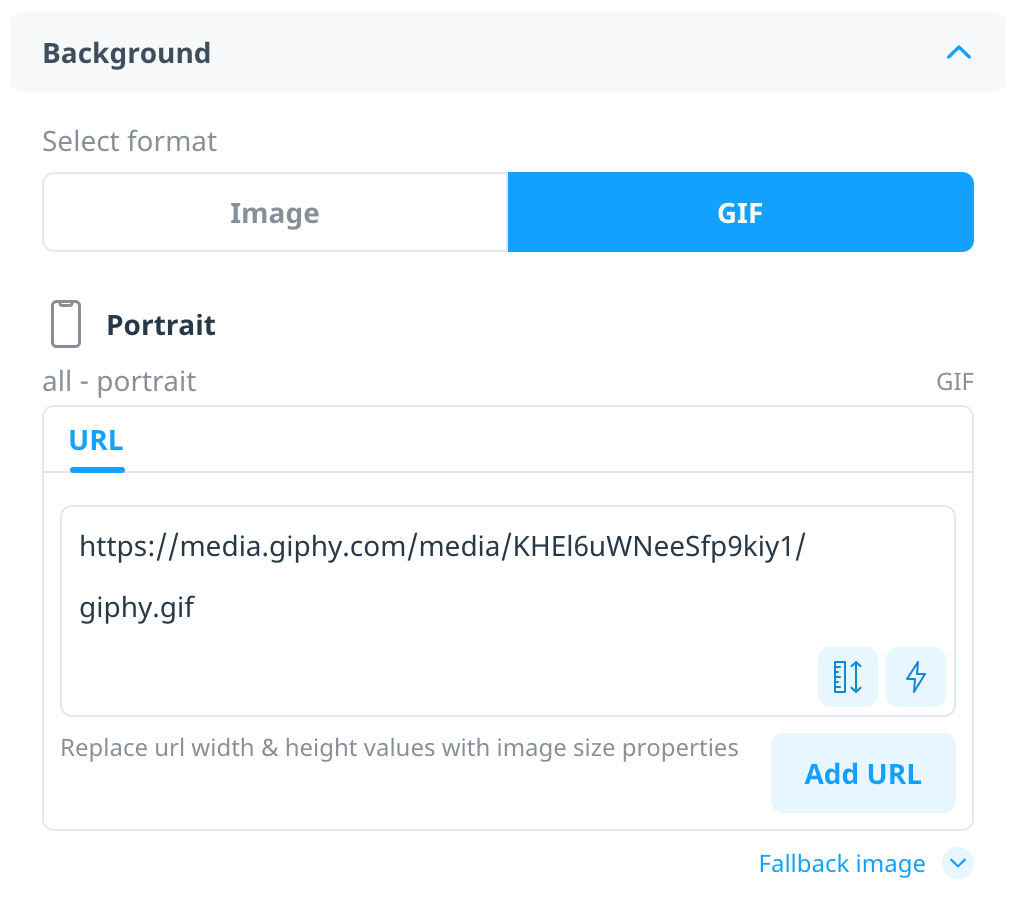
To use a GIF as your background:
- Select GIF and in the URL box, enter the relevant link.
- Once you’ve entered your image URL, select Add URL.
Dynamic URL properties
If your image URL supports height and width parameters, to insert image size properties in place of the respective URL references, select Insert image size property. Select the relevant width or height property and then select Insert.
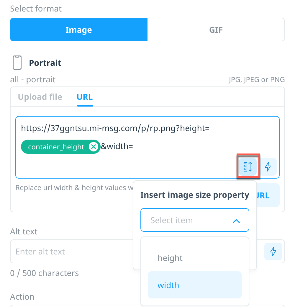
Alternatively, if you manage your image URL outside of Swrve, include the image size properties using the following syntax: ${container_height} and ${container_width}
For example: https://37ggntsu.mi-msg.com/p/rp/d281e6e5d92eab36.png?height=${container_height}&width=${container_width}
Optional image size, position, and fallback
Once you add an image or GIF URL, you have the option to manually set the size, position, or fallback image.
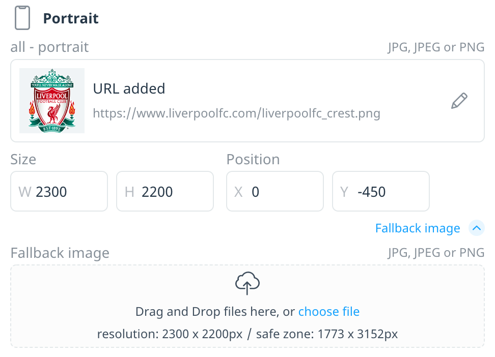
- Size – Enter the container width and height values for your image to fit inside. The Swrve SDKs scale down images with height and width values exceeding the container’s height and width, so the downloaded image fits within the image container you defined when creating the campaign. While not required, to help reduce the size of the images downloaded and stored on lower resolution devices, use dynamic URL properties to optimize images with dynamic size fields (see above).
- Position – Manually edit the image position by either moving the image in the device preview or by entering the number of pixels by which you want to move the image in the X and Y boxes. For example, if you enter 5 in the X box and 10 in the Y box, the image moves 5 pixels to the right and 10 pixels down from the center.
- Image fallback – To specify a fallback image if the image cannot be downloaded from the URL, select Fallback image and upload an image file. Swrve automatically resizes fallback images for all devices, so they don’t need to match the size of the image URL container.
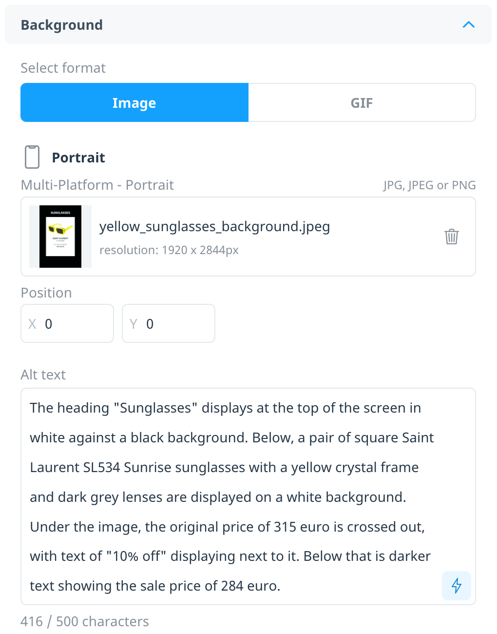
Alternative text
To add static or dynamic content that’s read aloud when a user selects the background image or an image button (that is, if the user has enabled accessibility settings on their device), enter the text in the Alt text box.
Background action
To include an engagement action for the background image, select an action from the Action list. No action is selected by default. However, Swrve requires that at least the background or one button has an action, even if that action is Dismiss. The available actions are:
- Dismiss – Dismisses the message.
- Deeplink – Directs the user to a particular custom location; for example, you might configure the action to direct a user to a specific website or section of your app. Coordinate with your development team to determine your app’s deeplink URL scheme.
- Copy to clipboard – Copies the action content to the user’s device clipboard. For example, you might provide a coupon code that the user can copy and apply later when making a purchase.
- Request Permission – Prompts the user to authorize permission for the selected capability and then triggers the related system permission prompt. The available permissions are as follows:
iOS Android Push notifications X X Location X Camera X X Photos X Contacts X X - Open app settings – Opens the app settings page. Use this option if prompting the user to manually update a permission when they previously denied it. To learn more about the target audience to use with this action, see Push notification permissions.
- Open notification permission settings – Opens the push notification permissions settings page. Use this option if prompting the user to manually update their notification permission if they previously denied it. To learn more about the target audience to use with this action, see Push notification permissions.
- Start Geo SDK – If your app uses Swrve’s Geo SDK, use this option to prompt the user to grant location permission. For more information, see the Swrve Geo SDK integration guide.
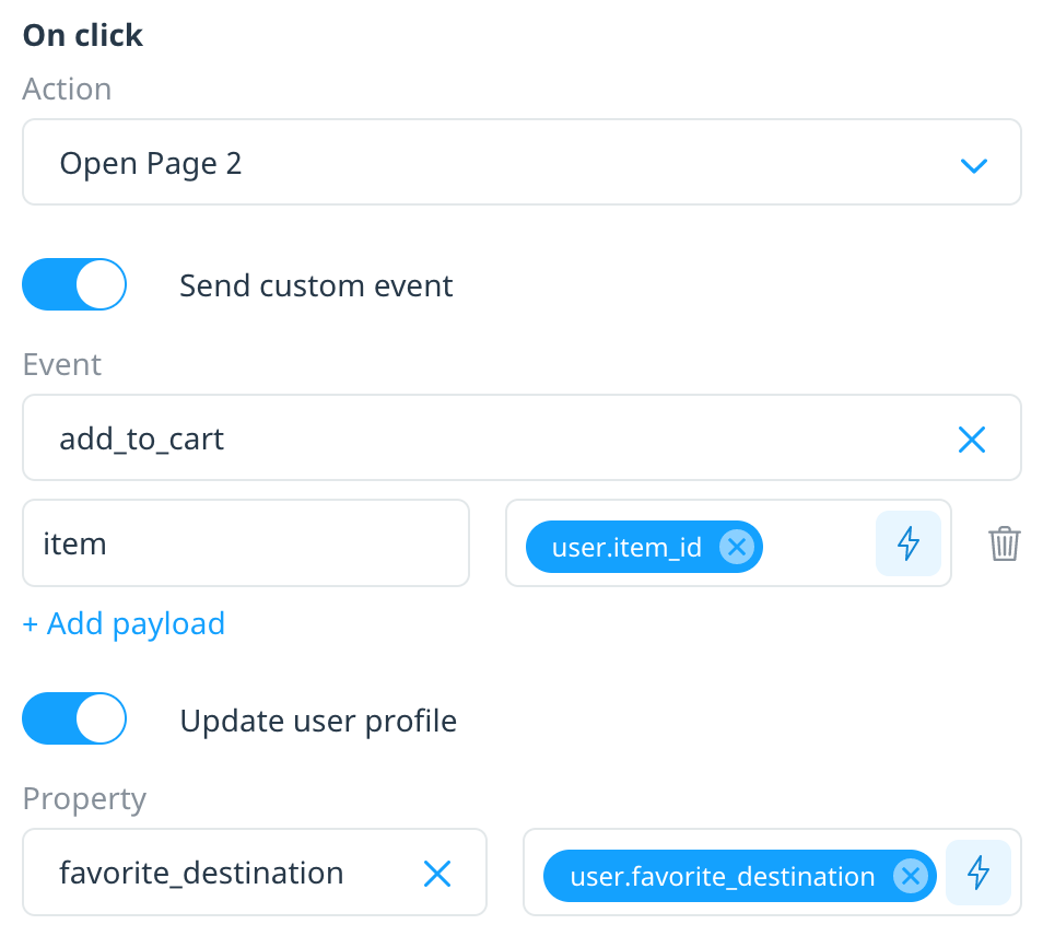
Additional data
In addition to selecting an action, use the following options to log supplementary data when the user engages with the campaign:
- Send custom event – Triggers a custom event for the user. Include up to five payload key/values, personalizable with realtime user properties. For example, you might send an in-app message that includes a question with each button providing a possible answer tracked as a unique event or payload value.
- Update user profile – Updates the value of a user property. For example, you might assign a unique user property value to each button, then target users based on their selection.
Buttons and text
Depending on the template you selected, include additional content with your message, such as buttons or text. Select + Add element and then select the content type.
Image
Upload an image file as the button or select URL to enter a personalized image link using realtime user properties.
Text
Add one or more lines of static or dynamic text that displays inside a text box and use the options available to set the text style and overflow behavior. There are two options for configuring the text styling for a text element:
- Apply a saved text style (for information on creating saved text styles, see Intro to in-app messages). After you select a saved text style, you have the option to also configure the horizontal alignment of the text and the text box’s padding.
- Create a new custom text style: Set the text style to Custom text style, then set the styling for the text and text box by selecting the:
- Font family, style, size, color, and opacity
- Background color and opacity (optional)
- Line height
- Horizontal alignment
- Padding
Note: To support full accessibility on a variety of devices, text box elements do not contain an action. Therefore, ensure your content includes an additional image button or text button if you want to include a call-to-action element in your message.
Button
After you select a saved button style, you have the option to set the button size and position. Enter static or dynamic text that displays inside a button container and use the options available to set the button style and overflow behavior. For more information on creating saved button styles, see Intro to in-app messages.
Note: For users who have accessibility settings enabled on their device, the device reads the button text value as the alt text. If you want to include custom alt text, select Add custom alt text and enter the text in the Alt text box.
Engagement action
To include an engagement action for images and buttons, select an action from the Action list. If you did not select an action for your background image, then you must specify an action for at least one of your buttons.
Video
Enhance in-app experiences by adding MP4 videos, perfect for product demos, promotional trailers, or immersive storytelling.
Video size
There are two size options for the video:
- Fixed size: Define the height and width of the container to display the video in. If the video’s aspect ratio does not match the containers’, the SDK scales down the video to fit within the container to avoid cropping any of the video’s content.
- Full screen: The video occupies the device’s entire screen. Since the video’s aspect ratio won’t perfectly match every screen size, the SDK zooms in on the video as needed to ensure the video still occupies the entire screen (with minimal cropping).
If using a multipage in-app message, the Video size setting – Fixed or Fullscreen – must be the same across all pages.
Video settings
Configure the start and end experience of the video, and the control users have for watching the video.
- Auto-play – Video will start playing automatically when message appears
- Show controls – Show video controls to the user
- Loop – Continue to repeat the video over and over
In Story mode campaigns, the Auto-play setting is always enabled and Show controls setting is always disabled.
Personalized content and actions
Use Swrve’s real-time user properties to include dynamic, personalized content in your in-app message—for example, the customer’s favorite sports team, game character, or movie genre. Swrve supports personalization of the image URL and text values, deeplink and copy to clipboard actions, and message center details.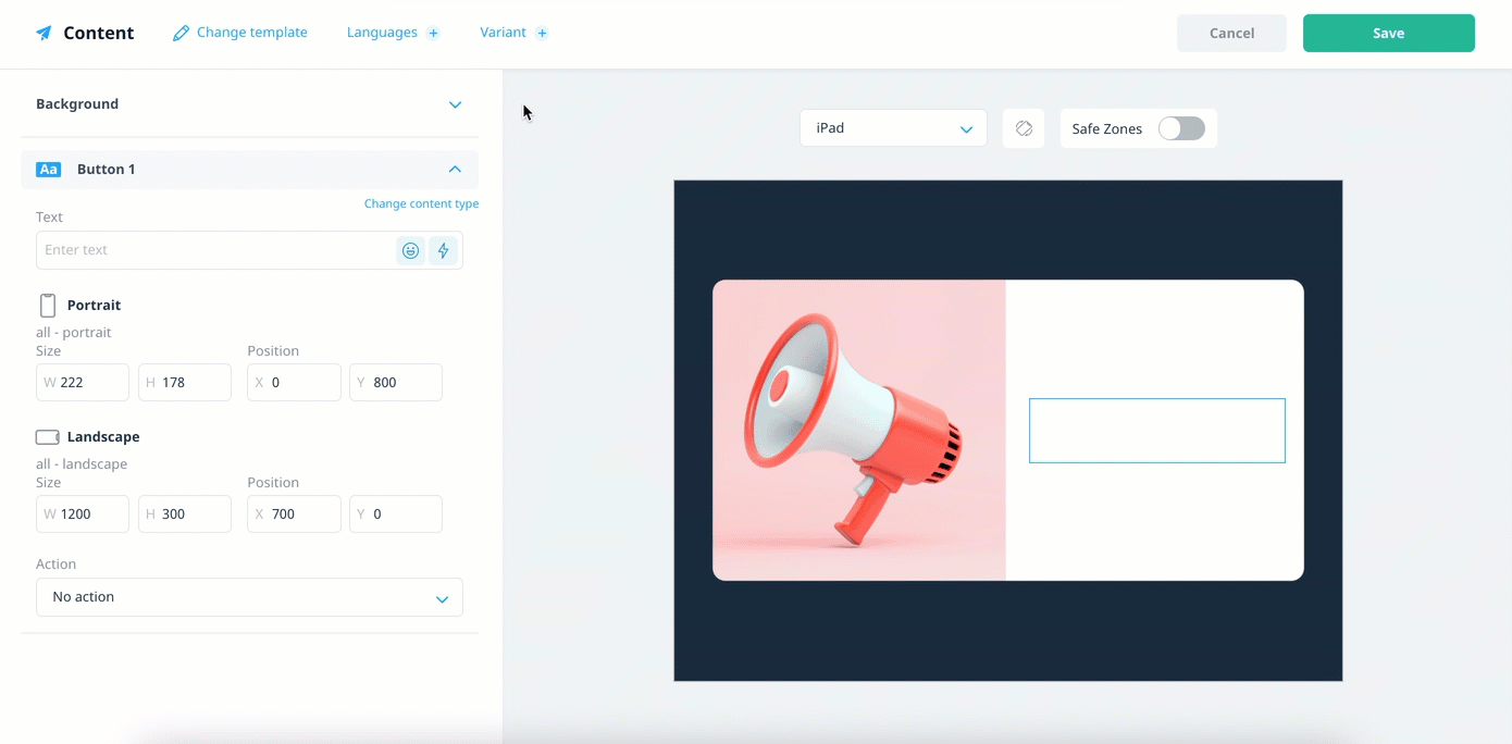
For more information on how to personalize your campaign content, see Campaign personalization.
Next steps
- Build multi-step campaigns using Pages. For more information, see Building Pages.
- Localize and test variations of your message content. For more information, see Localizing and A/B testing campaign content.
- Test your in-app message campaigns. For more information, see Testing in-app and embedded campaigns.