User cohorts report
The User Cohorts screen enables you to identify how the behavior of new users changes over time. By monitoring user cohorts, you can answer the following questions:
- How is the app performing, overall, in terms of the retention rate?
- Where is the app losing users?
- Is the rate at which the app loses users getting better or worse?
- Does the date on which users install your app affect retention (for example: Friday, January 1st, payday, Christmas)?
- Are there significant changes in how often users open the app and for how long they use it?
- Does the revenue generated by retained users decline over time?
If you identify negative trends in the way users are interacting with your app, you can use Swrve to implement strategies to improve user engagement.
For example, if your app contains a tutorial and you notice that retention drops a few days after users install your app, you could A/B test different versions of your tutorial. It might be the case that users are more likely to complete the tutorial and engage with your app if you reduce the number of tutorial steps or increase tutorial interactivity. For more information about resource A/B testing in Swrve, see Intro to Resource A/B Testing.
You can also target users with personalized in-app messages and push notifications to promote offers, provide tips or offer free virtual currency to keep them engaged. For more information about in-app messaging in Swrve, see Intro to In-App Messages. For more information about push notifications, see Intro to Push Notifications.
To access the User Cohorts screen, on the Analytics menu, select User Cohorts. The following image shows an example of a typical User Cohorts report:
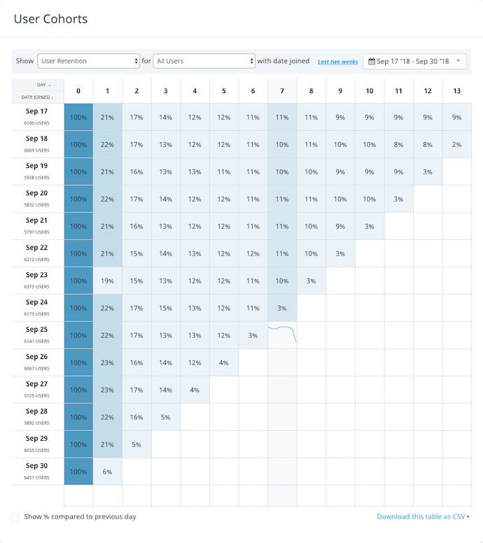
Each date within the past two weeks is represented as a row in the User Cohorts table. Each day is represented as a column starting with the install day (day 0). For example, in the table illustrated above, 6,100 users installed the app on September 17th. 21% of those 6,100 users opened the app 24-48 hours later, while only 17% of those 6,100 users opened the app 48-72 hours later.
Sparkline graphs enable you to view trends in how KPI values for a particular day vary depending on when the app was installed; placing your cursor on the column displays the sparkline graph as illustrated above.
Data point markers on the table enable you to view specific data for an install date and day; placing your cursor on any data point marker on the table displays a tooltip which provides a summary of the KPI data.
You can customize the data displayed on the User Cohorts screen by selecting the KPI and the user segment for which you want to view data. In addition, you can download User Cohort report data in comma-separated values (CSV) format.
Customizing item charts data
To customize the data included in your User Cohorts report:
- In the Show list, select one of the following KPI values:
- User Retention
- Avg Number of Sessions
- Avg Time in App (minutes)
- Avg Daily Revenue
- Total Revenue
- In the for list, select the user segment for which you want to view data.
- Define the time range for which the data is generated:
- To view data for the past 14 days, select Last two weeks.
- To manually define the time range, select the calendar field and select the desired date range.
- If you selected the User Retention KPI, an additional Show % compared to previous day check box displays below the table. Select this check box if you want Swrve to calculate user retention relative to the previous day. If the check box is clear (the default behavior), Swrve calculates user retention relative to the app installation date.
Saving data in CSV format
To save User Cohorts data in CSV file format, below the table, select Download this table as CSV.