Trend Reports
Trend Reports combine the functionality of the previous KPI Charts, Event Details, and Item Charts reports, with the option to include campaign metrics. Eventually all existing KPI Charts reports will migrate to the new format, however you can still view Events reports, Item Charts reports, and individual reports for your campaigns.
To access the Trend Reports screen, on the Analytics menu, select Trend Reports.
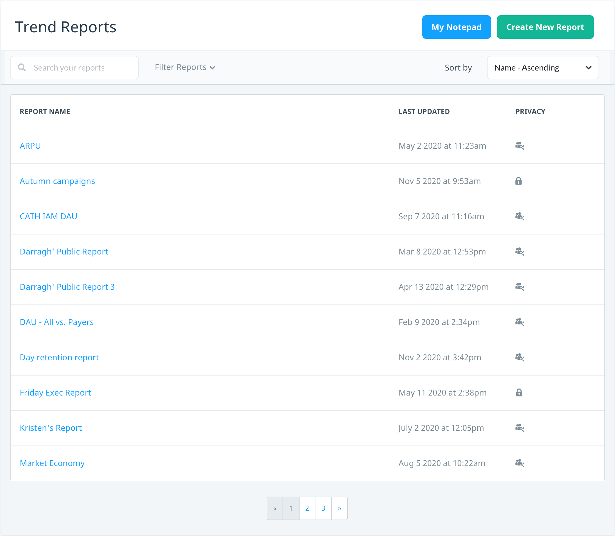
The following actions are available on the Trend Reports screen:
- Use the My Notepad report to create and quickly view a personalized report of the metrics that are important to you
- Create a new report
- Search, filter, or sort reports
- Edit your report name and privacy setting
- Duplicate a report
- Delete a report
Creating a new report
To create a new report:
- On the Trend Reports screen, select Create New Report.
- In the Create Report dialog, enter the Report Name, select the Report Privacy setting, and then select Create Report. Only you can view private reports, while anyone with the required app permissions can view public reports.
- The report page displays with an empty time series chart. To edit the chart name, select edit .
- To add data to the chart, select Add data to chart and complete the following:
- User Subset – select the subset of users you want to display data for:
- All Users – default setting that displays data for all your users.
- Segments – select a segment from the list to display data for a predefined segment.
- Resource A/B Test – select a resource A/B test from the list to display data for users in the test control and treatment groups.
- Campaigns – select the Campaign Type and name from the list. The list only shows the first 50 active campaigns, so if you don’t see the campaign you’re looking for, enter the campaign name and the list will display related search results as you type. Next, select the KPI from that campaign that you want to display data for. Depending on the type of campaign you select, you may also have to select the engagement metric you want to display data for (for example, in-app messages – After Seeing or After Clicking).
- Metric – select the metric you want to view data for:
- KPIs – select any of the default KPIs available in Swrve.
- Event Counts – select an event to view event counts over time.
- Item Purchases – select an item to view the number of items purchased over time.
- User Subset – select the subset of users you want to display data for:
- After you select the user subset and metric, select Add Data to Chart.
- By default, the chart displays data for the last week. To display another time series, select the date range box and select the desired time series (Last 7 Days, Last 30 Days, Last 90 Days, Last 12 Months), or select specific dates from the calendar.
- If required, add additional data to the chart, or add a new chart to the report.
- To save your report, select Save Report .
After you create a new report, it is displayed on the Trend Reports screen.
Managing Trend Reports
To view or edit an individual report, on the Trend Reports screen, select the report name.
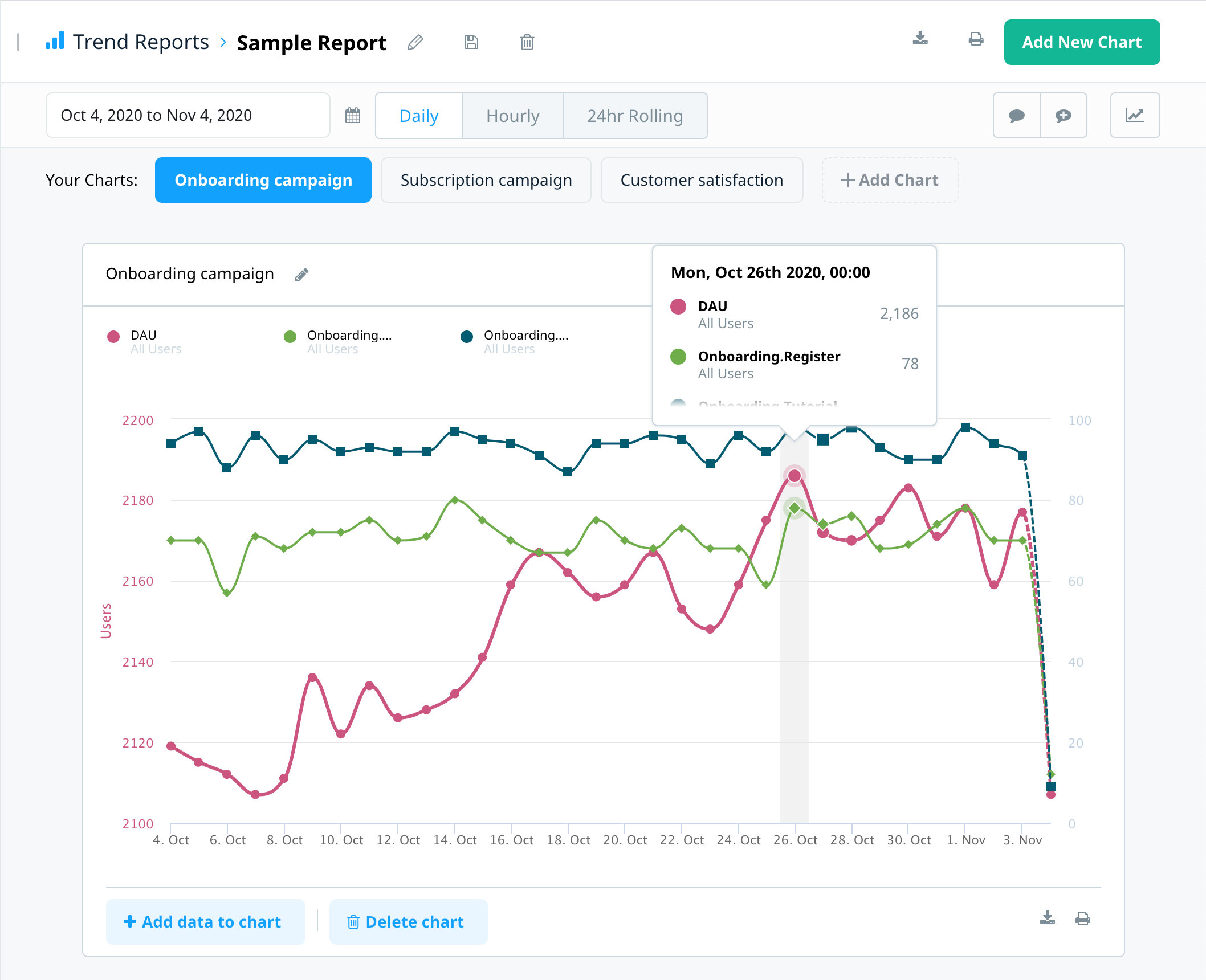
To quickly navigate between charts in a report, select the appropriate chart name label. Depending on the data sets you have added to a chart, the Y-axis displays the relevant metric(s), while the X-axis displays the time period. (The value k is appended to Y-axis values that are in the thousands. M is appended to values that are in the millions.)
Data point markers on the graph display specific data for a particular point in time. Point to any data point marker on the graph to display a tooltip that shows the KPI and segment data for that point in time.
Additional report actions
The following actions are available on the individual report page:
| Action | Description |
|---|---|
| Edit report/chart name and report privacy | To edit the report name and privacy, select edit next to the report name. To edit a chart name, select edit next to the chart name. |
| Save report | Select save to save any changes to the report. |
| Delete report | Select delete to delete the entire report. |
| Download report or chart CSV | Select download to download a CSV file of the entire report or individual chart data. |
| Print report or chart | Select print to print an image of the report or chart graph. |
| Add new chart | To add a new chart to the report, from the chart labels, select Add chart or under the bottom chart, select Add new chart. |
| Select time series | Select the date range box next to the calendar to select the time series you want to display data for. Select a set time period (Last 7 Days, Last 30 Days, Last 90 Days, Last 12 Months) or use the calendar to select a specific date range. |
| Select time granularity |
Select the time granularity for the graph. The available options are:
Note: For data displayed in Daily mode, KPIs for the current date are updated throughout the entire day. As a result, KPI data for the most recent date is partial data. For data displayed in 24hr rolling mode, the last two hours may be partial data as there is a 90-minute delay between events being sent to Swrve and events being displayed in Swrve. 24hr rolling mode is not available for MAU and DAU/MAU KPIs. |
| Show/hide or add annotations | Select Toggle Annotations to display or hide annotations on the report. Select Add Annotation to add a new annotation to the report. |
| Show/hide average lines | Select Toggle Average to display or hide the average values of all visible data points in the graph. |
| Show/hide data set | Each data set (such as a particular KPI, segment, or campaign) in the graph displays as a color-coded tile at the top of the graph. To hide or show a particular data set, select the color-coded tile. |
| Delete data set | To remove a data set, hover your mouse over the color-coded tile and select Delete data. |
| Add data set | Select + Add data to chart to add a new data set to the chart. |
| Delete chart | Select Delete chart to remove a chart from the report. |
| Zoom/reset zoom | To view a time range in closer detail, select a data point and drag your mouse to highlight the time period you want to zoom in on. To reset the zoom level, select Reset zoom. |
Report settings
To access Report Settings, on the Settings menu, select Report settings. Use the options on this screen to add annotations or configure how revenue KPIs are reported.
Configuring how revenue KPIs are reported
To define a multiplier that is applied to the default currency (USD) for reporting revenue KPIs, under Reporting Revenue, enter a Label and Multiplier. For example, you might define a multiplier to report revenue as profit, to report revenue in Euros, or to report revenue net of tax. For more information, see How do I configure how revenue is reported?
Report annotations
An annotation is a manual note that marks a significant event, such as the launch of a campaign. Add and manage annotations on the Report Settings screen, or add a new annotation directly in the report. For more information about managing annotations on the Report Settings screen, see Intro to analytics.