The KPI Metrics dashboard
The KPI Metrics dashboard contains the following three sections:
- Dashboard header
- Activity and monetization KPI graphs
- Session and top selling items charts
Dashboard header
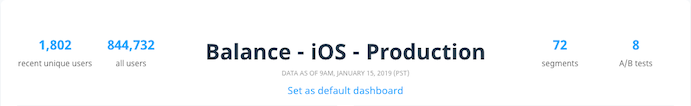
The KPI Metrics dashboard header displays the following basic information about the current app:
- The recent unique users (new users) for the past 24 hours.
- The total number of users that Swrve has recorded for the current app.
- The number of segments defined. This figure excludes archived segments.
- The number of resource A/B tests created. This figure excludes archived A/B tests.
KPI graphs
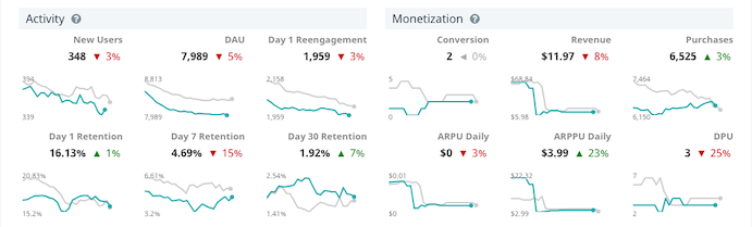
The Activity KPI graphs provide key metrics relating to new users, daily active users (DAU) and user retention. The Monetization graphs provide revenue metrics that tell you how well your users are currently converting in addition to the total revenue and number of purchases made by those users.
Each KPI graph contains the following data measurement items:
- Number value – displays the total value of the KPI over the past 24 hours.
- Percentage value – displays the percentage increase (green) or decrease (red) in the performance of the KPI over the past 24 hours compared to the performance of the KPI in the same 24-hour period one week ago.
- Blue sparkline – displays the trend in the KPI value over the previous 24 hours.
- Grey sparkline – displays the trend in the KPI value over the same 24 hour period one week ago.
Select a KPI graph to access an auto-generated Trend Report of your KPI metrics where you can analyze the data in greater detail. For more information about Trend Reports, see Trend Reports.
For information about changing how revenue KPIs are reported in Swrve, see How do I configure how revenue is reported?
Session and Top Selling Items charts
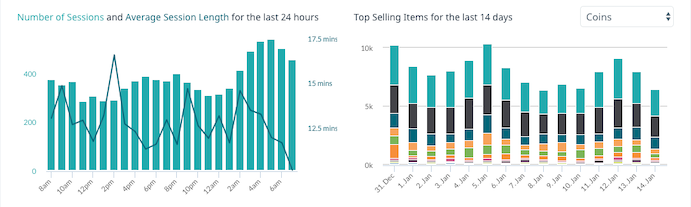
The Sessions bar chart displays the total number of sessions and the average length of a session over the past 24 hours. Hovering your mouse over a bar displays a tooltip that details the exact number of sessions and the average session length for that hour.
The Top Selling Items section chart displays the most frequently purchased items in the current app over the past 14 days. You can filter the item sales by the currency (such as coins, gold or gems) used to purchase the items. Hovering your mouse over a bar section for a particular day displays a tooltip that details the name of the item and the total number of sales for that item.
Next steps
- Find out more about KPIs in Swrve. For more information, see Intro to KPIs.
- Find out more about user segmentation in Swrve. For more information, see Intro to segmentation.
- Find out more about resource A/B testing in Swrve. For more information, see Intro to resource A/B testing.